Polar charts are one of the most misunderstood tools in lighting design. Most contractors and designers either ignore them or struggle to read them, which leads to poor fixture selection and wasted installations.
At OpenLumen, we’ve seen firsthand how understanding polar charts explained in simple terms transforms project outcomes. This guide shows you exactly how to read these charts and use them to make confident decisions about your lighting.
What Polar Charts Actually Show
The Core Function of Polar Charts
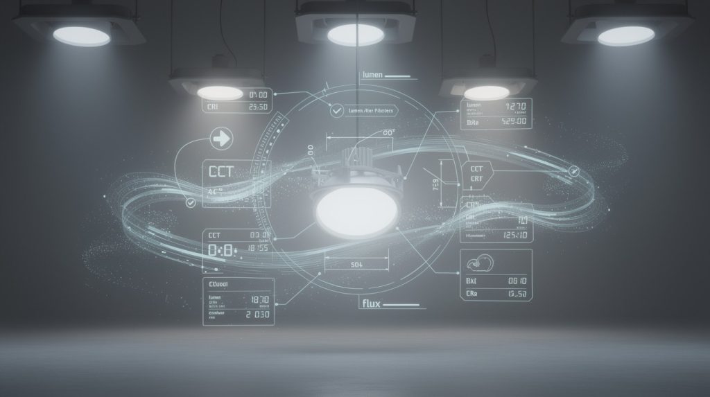
A polar chart is a two-dimensional graph that plots how light intensity changes as you move away from a light source’s center point. The light source sits at the origin, and spokes radiate outward at fixed angle increments. The curve itself shows candela values-the actual brightness measured in a specific direction. This differs fundamentally from lumens, which measure total light output. A fixture might produce 5,000 lumens total, but a polar chart reveals where those lumens actually land and how bright each direction becomes. Most contractors never see this distinction, which explains why they end up with uneven lighting or coverage gaps. The chart encodes three-dimensional light distribution on a flat surface, making it possible to understand a fixture’s real performance without installing it first.
Narrow vs. Broad Distributions
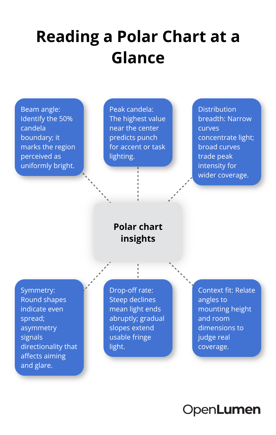
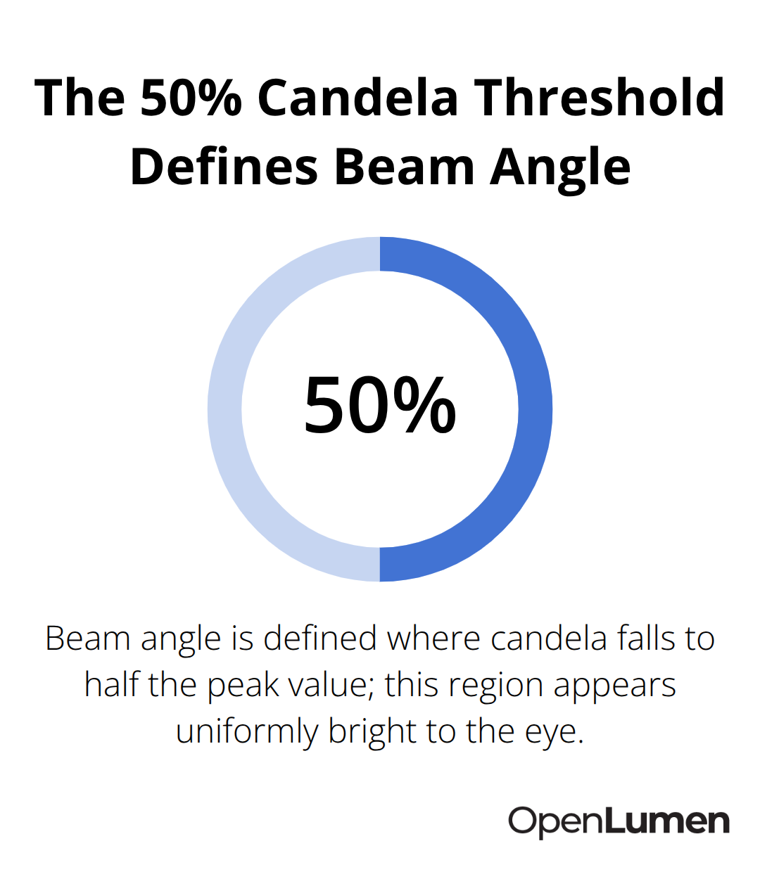
The distribution shape tells you everything about how a fixture performs in your space. A narrow curve that stays close to the center indicates high intensity directly below the fixture with light dropping off quickly at the edges-ideal for spotlighting or accent work. A broad curve that extends far from the center means light spreads widely with lower peak intensity, better for general area coverage. The 50% intensity threshold (where candela values fall to half the center brightness) defines the beam angle and represents the region your eye perceives as uniformly bright. This practical standard matters because it shows you exactly where usable light ends.
Comparing Fixtures with Confidence
When you compare two fixtures, their polar charts reveal which one actually matches your space’s geometry and task requirements. A fixture with a 60-degree beam angle concentrates light in a tighter cone than one with a 120-degree angle, and the polar chart proves it visually. Contractors who skip this step often choose fixtures based on wattage or price alone, then discover mid-project that coverage doesn’t work. Distributors who can read and explain polar charts to customers win more competitive bids because they demonstrate real knowledge about performance, not just specifications on a sheet. This skill separates professionals who solve problems from those who simply move inventory.
How to Read Candela Values and Intensity Patterns
Understanding Candela Values and What They Mean
Candela values on a polar chart represent the actual brightness measured in a specific direction from the light source, and they form the foundation for understanding whether a fixture will perform in your space. The center of the chart marks the highest intensity value, and as you move outward along the spokes, the numbers tell you exactly how bright the light becomes at each angle. A fixture with a center candela value of 2200 delivers significantly more directional punch than one rated at 800-that’s not a minor difference, it’s the difference between a focused accent light and a soft, wide-coverage source.
Most contractors mistake high lumens (total light output) for high performance, but candela reveals the truth: a 5000-lumen fixture with poor optics might deliver only 400 candelas in the direction that matters, while a 3000-lumen fixture with sharp lenses delivers 1800 candelas where you need it. The intensity pattern itself shows how quickly light drops off as you move away from the fixture’s center axis.
Recognizing Distribution Patterns
A steep drop-off within 10 degrees indicates a narrow, concentrated beam-perfect for highlighting merchandise or architectural features. A gradual decline across 30 or 40 degrees signals a broader distribution that fills rooms more evenly. The 50% candela threshold (the point where brightness falls to half the peak value) defines your beam angle and represents the region where the human eye perceives the light as uniformly bright. This isn’t theoretical-it’s the practical standard the lighting industry uses because it matches how we actually see light in real spaces.
Matching Distribution Shapes to Your Project
A narrow distribution that hugs the center axis works for accent lighting, task-specific illumination, or spaces where you need intensity concentrated on a small area-think retail displays or architectural highlighting. A broad distribution that spreads across 90 degrees or more delivers ambient light and covers large areas without gaps, ideal for warehouses, open offices, or general area lighting.
When you compare two fixtures, overlay their polar charts mentally: the one that extends farther from the center while maintaining usable intensity wins for coverage; the one that peaks higher near the axis wins for focused tasks. Avoid the common mistake of assuming a 60-degree beam angle means the light stops at 60 degrees-it means usable light extends to 60 degrees from center, and some light travels beyond that point.
Spotting Symmetry and Off-Axis Performance
The polar chart also reveals symmetry: a perfectly round distribution means light spreads equally in all directions, while an asymmetrical shape indicates that the fixture performs differently depending on how you aim it. This matters in real installations-a fixture with an off-axis hot spot might look unbalanced in a retail space or create glare in an office if you don’t account for that pattern during layout planning.
Contractors who understand these distinctions specify fixtures correctly the first time instead of discovering mid-installation that a 40-degree beam leaves dark corners or that a 120-degree beam spreads light so thin it fails to meet task illumination targets. Once you master reading these patterns, the next step involves comparing multiple fixtures side by side to select the right luminaire for your specific application and space geometry.
Putting Polar Charts to Work on Real Projects
Selecting the right luminaire without polar chart analysis is like choosing a ladder based solely on its weight. You might end up with something that technically works, but it won’t perform the way your project actually needs it to. Start by defining your task requirements first-not fixture preferences. A retail display needs 500 to 1000 footcandles on merchandise, while general office work typically requires 300 to 500 footcandles on the work plane. Once you know your target illumination level, pull the polar charts for three to five candidate fixtures and compare their candela values at the angles most relevant to your space geometry. If your fixture mounts 10 feet high and needs to light a 20-foot-wide area, the distribution shape matters far more than the fixture’s total lumen output. A fixture with 4000 lumens and a 40-degree beam concentrates light where you need it; a 6000-lumen fixture with a 110-degree beam spreads that energy too thin and fails to hit your footcandle targets. This is where contractors separate themselves from order-takers. The ones who pull polar charts before submitting proposals win projects because they can confidently state how bright the space will actually be, not just guess based on wattage.
Comparing Fixtures Side by Side Reveals Real Performance Differences
Place two polar charts next to each other and the differences become undeniable. The fixture whose curve extends farther from the center while maintaining strong candela values delivers broader coverage. The fixture whose curve peaks higher near the axis delivers more concentrated punch. If you light a warehouse and compare a 60-degree beam against a 90-degree beam from the same manufacturer, the polar charts show exactly how much additional coverage the 90-degree option provides and whether that translates to the illuminance uniformity your space requires. Many contractors assume wider is always better for coverage, but polar charts prove that a poorly designed 120-degree distribution with weak off-axis candela values performs worse than a sharper 70-degree design with strong intensity across its usable range.
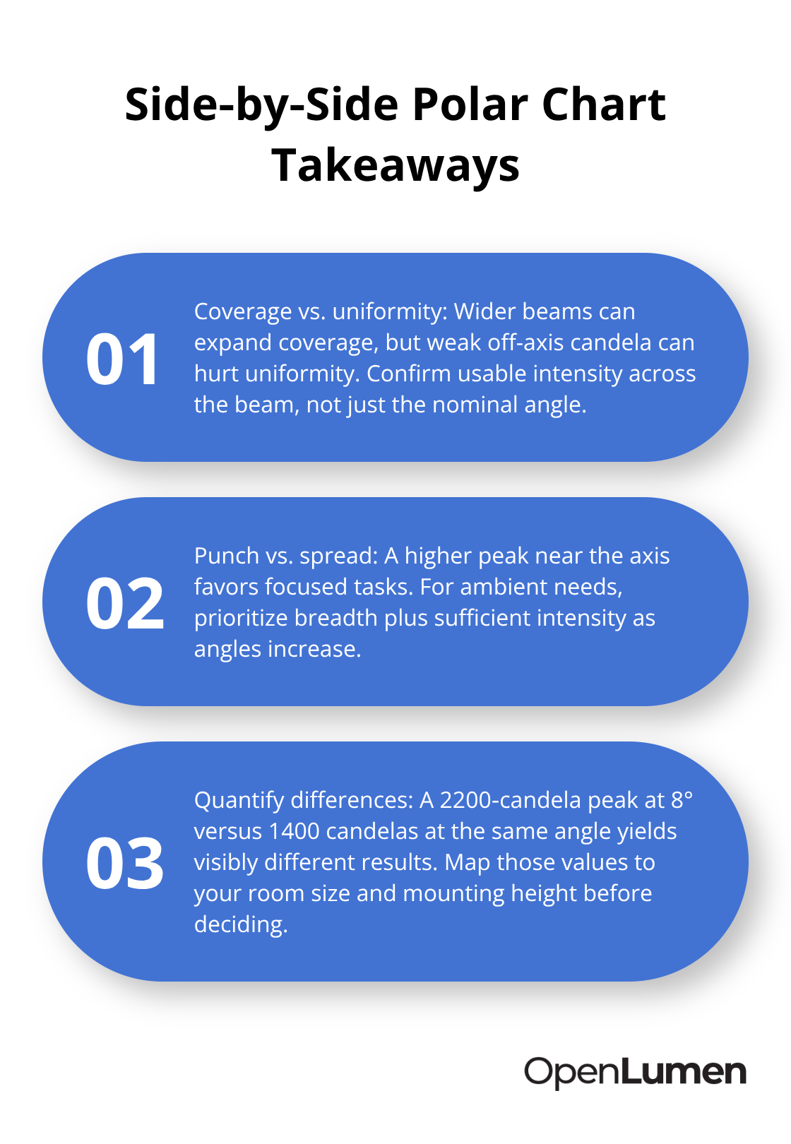
Overlay the curves mentally against your room dimensions and fixture mounting height. A 2200-candela fixture at 8 degrees delivers measurably different results than a 1400-candela fixture at the same angle, and that difference compounds across an entire installation. Distributors who can walk customers through this comparison close sales faster because they answer the real question: will this actually light my space properly? The answer lives in the polar chart, not the spec sheet.
Matching Distribution Shapes to Room Geometry
The distribution shape determines whether a fixture works for your specific space. A fixture with a symmetric, smooth curve that hugs the center axis works well for accent lighting or retail displays. That same fixture in a warehouse where you need even ambient coverage creates gaps between fixture zones. Conversely, a broad asymmetrical distribution might work perfectly for wall washing but create glare problems in an office if light bounces off glossy surfaces at certain angles. The polar chart reveals these risks before installation. Look at how quickly intensity drops off beyond the 50% threshold-a steep cliff means usable light ends abruptly, while a gradual decline means some light extends into fringe areas. This matters for spacing calculations. If you space fixtures based on manufacturer recommendations without checking the actual distribution shape, you might discover mid-project that the spacing creates dark bands between coverage zones.
Preventing Installation Failures Through Pattern Analysis
Professional lighting designers generate simulation reports that show footcandle levels point-by-point across the work plane, and those reports depend entirely on accurate polar chart interpretation. The fixture summary in a photometric report lists each luminaire model used and its quantity per room; if you select the wrong fixture based on incomplete polar chart analysis, that error propagates through the entire installation. Contractors who develop the discipline to compare polar charts before every bid eliminate most design failures and build reputations for delivering projects that actually work. A fixture with a 2200-candela peak and a steep drop-off within 10 degrees concentrates light in a tight cone-perfect for highlighting merchandise or architectural features. A fixture with a 1400-candela peak and a gradual decline across 30 degrees fills rooms more evenly. The difference between these two patterns determines whether your installation succeeds or fails. When you compare polar charts, you answer the question that matters most: does this fixture’s light distribution match my space’s geometry and task requirements? That answer prevents costly mistakes and ensures your projects deliver the illumination levels your clients actually need.
Conclusion
Polar charts explained in practical terms transform how you select fixtures and prevent costly installation failures. Stop relying on wattage, lumens, or price alone-instead, compare the candela values and distribution shapes that actually determine whether a fixture performs in your space. A fixture with 2200 candelas and a narrow 40-degree beam delivers measurably different results than one with 1400 candelas and a 90-degree spread, and that difference separates professionals who solve problems from those who simply move inventory.
The real advantage emerges when you develop the discipline to pull polar charts before every bid and overlay them against your room dimensions and mounting heights. Check how quickly intensity drops off beyond the 50% threshold, identify whether the distribution is symmetric or asymmetrical, and validate that your design meets footcandle targets before installation begins. These steps take minutes but eliminate the mid-project discoveries that damage your reputation and drain your margins, and contractors who master this skill close more competitive bids because they can confidently state exactly how bright a space will be.
We at OpenLumen built a free, browser-based platform that simplifies this process significantly-you can create photometric layouts, run real-time illuminance analysis, and generate professional reports without expensive software or steep learning curves. The platform includes a community-verified luminaires library with instant access to polar charts, BUG ratings, and zonal lumens data, so you compare fixtures side by side and validate your designs in minutes. Visit OpenLumen to start designing with confidence and transform how you specify lighting for every project.
The information provided is for general educational purposes only and should not be considered professional engineering or lighting design advice. Always verify project requirements, local codes, and specifications with qualified professionals before making final decisions.