Proposals are often the first real impression clients get of your work. A messy, inconsistent presentation can undermine your credibility before you even discuss pricing.
At OpenLumen, we’ve seen how layout templates for proposals transform the way contractors and distributors present their services. When you standardize your format, you eliminate hours of formatting work and ensure every proposal reflects your brand’s professionalism.
Why Standardized Templates Save Time and Money
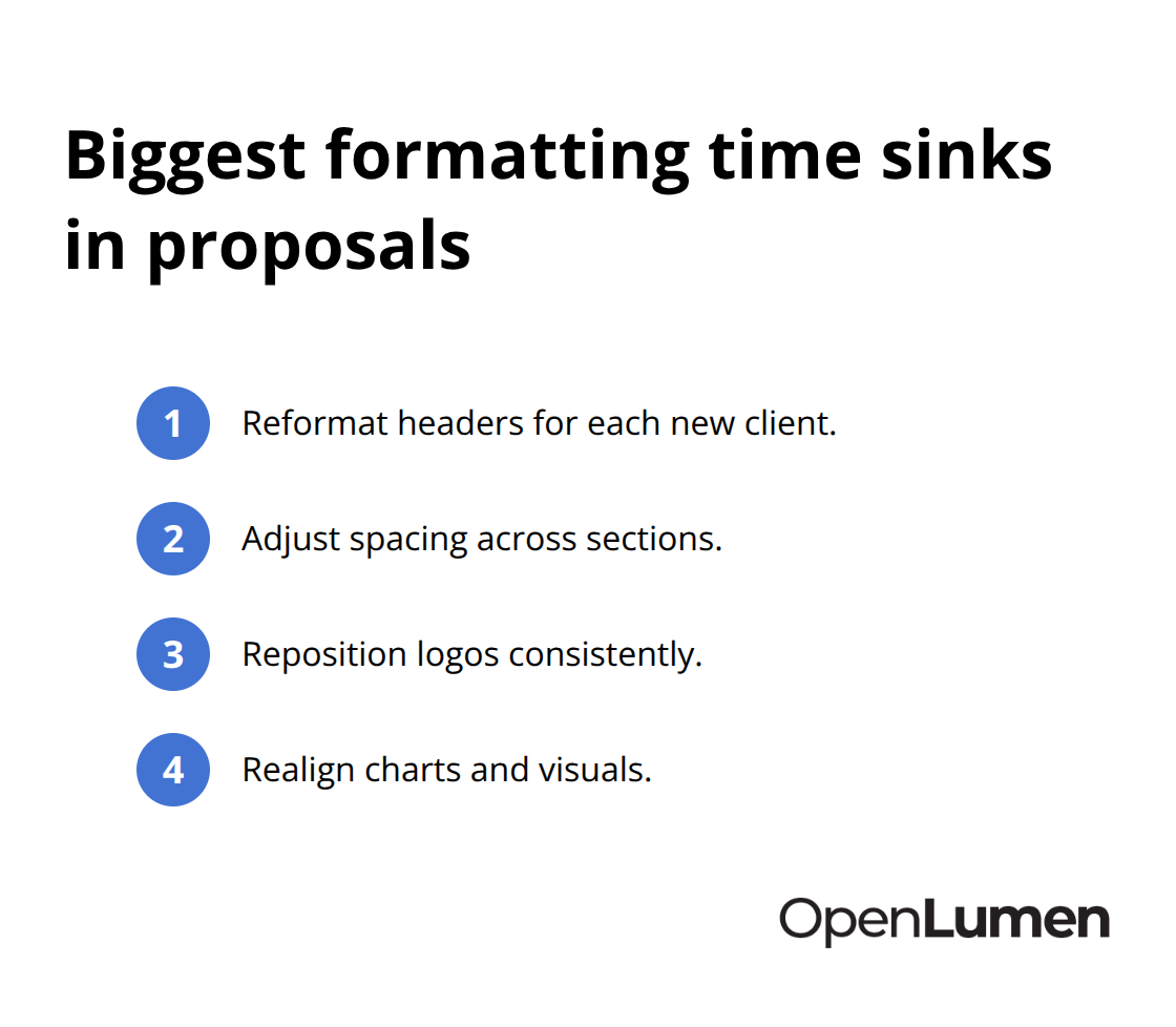
Contractors and distributors waste significant time rebuilding proposal layouts from scratch. Each new client means reformatting headers, adjusting spacing, repositioning logos, and realigning charts-work that adds nothing to your actual proposal quality. Teams without standardized templates spend 3 to 5 hours per proposal on formatting alone. That time compounds quickly. A contractor sending 20 proposals annually loses 60 to 100 hours just arranging pixels.
A standardized layout template eliminates this entirely. You create the structure once, then populate content. No reformatting. No alignment issues. No accidental brand inconsistencies. The financial impact is real: if your billable rate is $100 per hour, those 60 to 100 lost hours represent $6,000 to $10,000 in wasted capacity annually. Templates recover that time immediately.
Consistency Builds Trust Faster Than Words
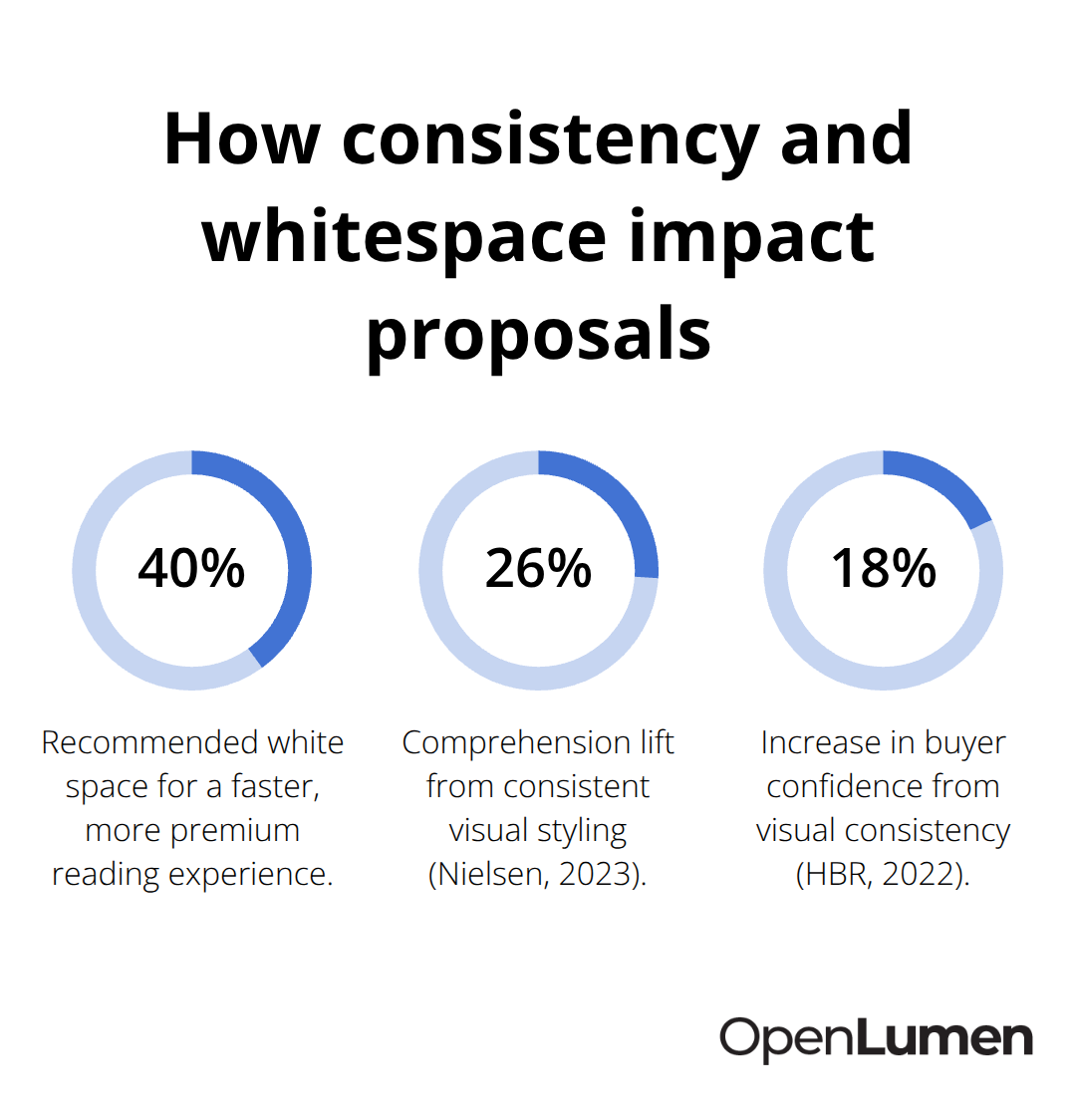
Clients notice when proposals look polished and intentional. A 2022 study by the Harvard Business Review found that visual consistency in business documents increased buyer confidence by 18 percent and accelerated decision-making timelines. When every proposal uses the same executive summary layout, the same pricing table format, and the same case study presentation, clients perceive your organization as structured and reliable. They don’t consciously think about the template-they simply feel that you’re professional. Conversely, a proposal with misaligned text, varying font sizes, or inconsistent spacing signals carelessness, even if your actual work quality is excellent. Templates enforce visual discipline across all touchpoints. Your logo always appears in the same location. Your brand colors appear in the same proportions. Your pricing breakdown uses identical table formatting. This uniformity is not decorative; it directly influences how clients evaluate your competence before they ever read a single sentence about your qualifications.
Customization Without Starting Over
The best proposal templates balance structure with flexibility. You need a locked framework that ensures consistency but allows rapid customization for different project types and client needs. A template should include modular sections-an executive summary block, a problem statement block, a solution block, a timeline infographic, a pricing table, and a case study section-that you can mix, reorder, or duplicate without breaking the overall design. This modularity means you spend time on what actually matters: tailoring your message to each client’s specific situation. You’re not wrestling with formatting. You’re writing better proposals faster because the visual foundation is already solid.
What Comes Next
The structure matters, but the content inside that structure determines whether clients say yes or no. The next section covers the essential elements that every proposal template must contain to move prospects from interest to commitment.
What Your Proposal Template Must Actually Contain
State Your Promise in the Executive Summary
An executive summary sits at the front of every proposal for a reason: decision-makers rarely read beyond the first page. Your summary must state the client’s problem in one sentence, your approach in another, and the expected outcome with a specific metric. If a facility owner struggles with energy costs in a warehouse, your summary might read: We will redesign your lighting layout to reduce consumption by 25 percent while improving task visibility, saving approximately $12,000 annually on electricity. This is not vague positioning. This is a concrete promise that justifies reading further.
List Deliverables with Exact Dates and Sequences
The scope of work section that follows must list deliverables in the exact sequence you will execute them. Instead of writing we will design your lighting system, write we will conduct a site survey on March 15, deliver preliminary layouts by March 22, run illuminance analysis using photometric data on March 29, and provide final documentation by April 5. Contractors who include specific dates see higher acceptance rates because clients know exactly when to expect each milestone. Vague timelines create friction; precision builds confidence.
Break Down Pricing Into Transparent Line Items
Pricing transparency determines whether prospects move forward or stall. A breakdown that shows labor, materials, equipment, and contingency as separate line items costs more credibility than a single lump sum. If your proposal includes lighting design at $2,500, fixture procurement at $8,000, installation at $3,200, and a 10 percent contingency buffer at $1,370, clients understand where their money goes and feel less exposed to hidden costs.
Include Visual Mockups and Photometric Data
Visual mockups matter more than most contractors realize. A 2D floor plan with fixture placement, illuminance values overlaid, and a brief technical specification sheet transforms an abstract proposal into something tangible. Include polar charts showing how fixtures distribute light, zonal lumens data to prove coverage, and BUG ratings if applicable. Contractors who embed these photometric details see proposal acceptance rates climb because clients can visualize the final result before signing. Tools like OpenLumen generate these metrics instantly, letting you add professional photometric documentation without manual calculations.
Prove Results With a Specific Case Study
Your template should reserve dedicated space for one relevant case study that demonstrates similar scope and outcomes. Not a generic success story, but a specific project: you redesigned lighting in a 15,000-square-foot manufacturing facility, reduced energy use by 28 percent, and improved worker safety metrics by 34 percent within six months. This concrete proof moves skeptical prospects faster than any testimonial ever could. The next section covers how to structure your template’s visual design so these elements work together to persuade clients.
Designing Templates That Actually Get Users
Build Structure That Your Team Will Actually Use
Your proposal template lives or dies based on whether your team actually uses it. A beautifully designed template that sits unused in a folder does nothing. The template must be fast enough that using it feels faster than starting from scratch, and flexible enough that customization takes minutes, not hours. Start with a single-column or two-column grid structure-avoid complex multi-column layouts that break when you swap in different content widths. A 12-column grid gives you flexibility without introducing alignment chaos. Set your typeface system once: one font for headings, one for body text, sizes locked at 10pt, 12pt, 14pt, and 16pt. Designers often overthink typography, but the real win is consistency, not creativity.
Automate What Repeats Across Every Proposal
When your team opens the template, they should see placeholders for client name, project dates, and key metrics that auto-populate across the document. If your team has to manually update the same information in five places, they will skip the template. Use conditional formatting so that when someone changes the project budget in one cell, the summary automatically recalculates. Tools like Word with built-in styles or Google Docs templates handle this without requiring technical setup. White space matters far more than decoration. A proposal with 40 percent white space reads faster and feels more expensive than one packed with graphics. Try one visual element per page maximum-either a chart, a mockup, or a case study photo, not all three. Data visualization deserves its own attention: use consistent chart styles across the template, match axis labels and currency units, and avoid 3D effects that obscure actual values. A 2023 Nielsen study on document design found that proposals with consistent visual styling increased comprehension by 26 percent compared to mixed formatting.
Embed Real Numbers Into Your Case Study Section
Your case study section must include specific numbers tied to real client situations, not generic success stories. Instead of improved energy efficiency, write reduced annual energy costs by 28 percent or increased task visibility while cutting fixture count by 15 percent. Include the project type, facility size, timeline, and measurable outcome. Contractors who embed one strong case study in their template see acceptance rates jump by 12 to 18 percent because prospects see themselves in the results.
Create Modular Blocks That Snap Together
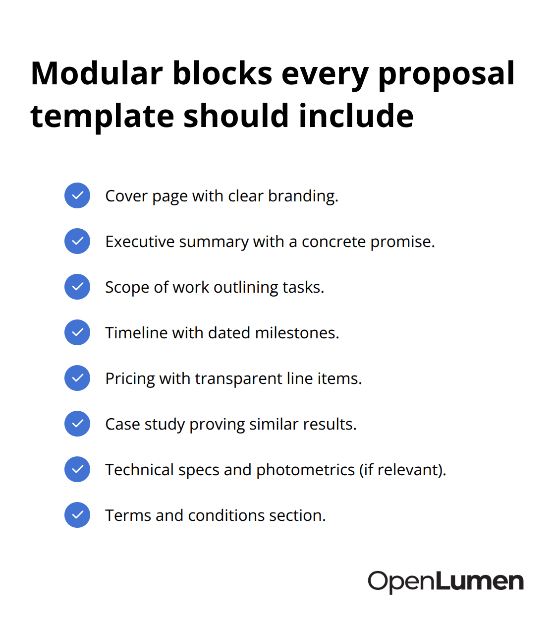
Make your template modular so different sections can be reordered without breaking the design. A lighting proposal might need the executive summary first, but a retrofit proposal might need the budget analysis earlier to address cost concerns upfront. Build your template as independent blocks-cover page, executive summary, scope, timeline, pricing, case study, technical specs, terms-that snap together like LEGO pieces. Your team should be able to drag sections around without worrying about orphaned headers or broken page breaks.
Control Versions So Everyone Uses the Latest Template
Store your template in a shared location with version control so that when you improve it, everyone uses the latest version. A common mistake is emailing templates around, which creates five slightly different versions floating through your organization. Use SharePoint, OneDrive, or Google Drive with edit access locked to viewing until someone makes an intentional copy for a new proposal. This prevents accidental overwrites and keeps your brand consistent. Test your template with your actual team before rolling it out. Have a contractor or designer build a real proposal using it and time how long it takes. If it takes longer than 90 minutes from start to finish, the template is too complex. Your goal is 45 to 60 minutes for a standard proposal. Simplify ruthlessly until your team reaches that speed.
Final Thoughts
Layout templates for proposals eliminate the friction that slows down your sales cycle. When your team stops rebuilding formatting and starts focusing on client-specific messaging, proposals move faster and feel more polished. The time savings compound quickly-60 to 100 hours annually recovered, mistakes caught before they reach clients, and visual consistency that signals professionalism before anyone reads a word.
Templates shift your team’s energy toward what actually wins deals: understanding each client’s specific problem and articulating a concrete solution with measurable outcomes. Your executive summary becomes sharper, your scope of work becomes more precise, and your case studies become more relevant. Clients notice this difference-when every proposal arrives with the same polished structure, transparent pricing breakdown, and professional visual presentation, they perceive your organization as reliable and competent.
Start by auditing your current proposal process and identifying where inconsistencies slip in. Then build or refine a single template that your team will actually use, lock the structure, set the visual rules, and make customization fast. If you design lighting proposals, OpenLumen generates the photometric documentation that makes your proposals credible-polar charts, illuminance analysis, BUG ratings, and zonal lumens data-instantly and without expensive software.
The information provided is for general educational purposes only and should not be considered professional engineering or lighting design advice. Always verify project requirements, local codes, and specifications with qualified professionals before making final decisions.