Polar chart interpretation basics are essential if you want to select the right luminaire for any project. Most lighting professionals rely on these charts to understand how light spreads and where it concentrates most intensely.
At OpenLumen, we’ve seen how quickly teams can make better decisions once they learn to read polar data. This guide breaks down what those charts actually tell you and how to use them on your next job.
What Polar Charts Actually Show
A polar chart displays candela values across every direction a luminaire emits light, using angles to map intensity distribution. The radial distance from the center represents how bright the light is in that direction, measured in candelas. Unlike a specification sheet that lists a single lumen output, a polar chart shows where those lumens actually go-whether the fixture throws light downward for task work, sideways for ambient coverage, or upward for indirect ceiling reflection. This directional breakdown makes polar charts invaluable for any lighting project. You cannot design a lighting layout or compare two fixtures fairly without understanding their distribution patterns.
A 5,000-lumen fixture with narrow downward throw behaves completely differently from a 5,000-lumen fixture that spreads light equally in all directions, yet both might have identical lumen values on a spec sheet.
Comparing Fixtures Without Guesswork
Photometric reports from manufacturers include polar plots alongside candela data, and this information tells you whether a luminaire fits your project. When you compare two fixtures side by side, the polar chart reveals beam angle, field angle, and whether the light pattern is symmetric or asymmetric. A symmetric Type V pattern concentrates light in a narrow cone below the fixture-ideal for downlighting retail displays or task lighting over workbenches. An asymmetric Type III pattern spreads light unevenly, useful for wall grazing or asymmetric street lighting where you need more light on one side than the other. The field angle, defined at 10 percent of maximum intensity, is always larger than the beam angle at 50 percent of maximum intensity. This distinction matters because a fixture might have adequate light at the edges of your coverage area even if the peak intensity seems low. If you focus only on peak candela values and ignore the full polar distribution, you will select the wrong fixture for your space.
Why Polar Data Beats Lumen Counts Alone
Total lumens tell you how much light a fixture emits overall, but they do not tell you if that light reaches your work plane or reflects off surfaces where you need it. A 10,000-lumen fixture mounted 20 feet high delivers far less usable light on a desktop than a 3,000-lumen fixture mounted 8 feet high, because distance weakens illuminance dramatically. Polar charts show intensity distribution, which combines with mounting height, fixture tilt, and room geometry to determine actual foot-candles on your work surface. The Moreno et al. study on LED street lighting published in Applied Optics (2014) demonstrated that ground illuminance depends directly on the angular intensity profile shown in polar diagrams. Designers who understand polar distribution can predict illuminance accuracy at early design stages without running full simulation software. This speeds up the selection process and reduces costly revisions after installation.
Moving From Theory to Real Decisions
Once you grasp what a polar chart shows, the next step is learning which specific metrics matter most for your project type. Different applications-retail, warehouse, outdoor, or indirect ceiling lighting-each rely on different aspects of the polar data to make the right choice.
How to Read Polar Charts Without Getting Lost
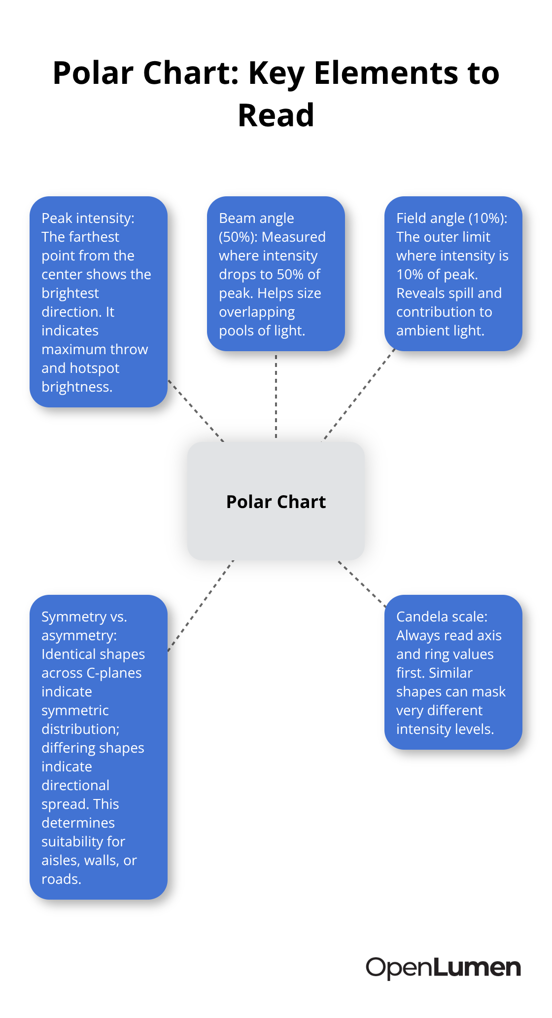
Polar charts look intimidating at first, but they follow a simple logic once you know what to look for. The radial lines extending from the center represent angles, and the distance from the center to the outline shows candela intensity in that direction. On most polar plots, the top of the chart points upward (0 degrees), the sides represent 90 degrees, and the bottom represents 180 degrees. This means a fixture that concentrates light downward will show a large bulge at the bottom of the chart, while a fixture throwing light sideways will bulge outward to the left or right. The grid rings represent candela values, and each ring step might represent 500, 1,000, or 5,000 candelas depending on the fixture brightness. When you compare two luminaires, always check the candela scale first because identical-looking shapes can represent vastly different intensity levels. A fixture showing a candela range of 0 to 20,000 will look much flatter than one scaled 0 to 5,000, even if both distribute light similarly. This is why reading the axis labels and scale matters more than visual impressions.
Peak Intensity Tells You Maximum Reach
Peak intensity is the single brightest point on the polar chart, measured in candelas. You find it by locating the outline’s furthest point from the center. For a downlight, this peak usually sits at the bottom of the chart (straight down from the fixture). For an asymmetric wall washer, the peak might angle off to one side. Peak candela directly affects how far the light throws and how bright the center of the lit area appears. A fixture with 15,000 candelas at peak will create a much brighter hotspot than one with 3,000 candelas, assuming the same mounting height and target distance. However, peak intensity alone does not guarantee good coverage because a fixture can have high peak candela but weak light at the edges of your coverage zone. This is where beam angle and field angle enter the decision. Beam angle, defined at 50 percent of maximum intensity, shows where the light remains reasonably strong. Field angle, defined at 10 percent of maximum intensity, shows the outer boundary where light still contributes to illumination. For a retail downlight, you want the beam angle to match your spacing and mounting height so the lit circles overlap slightly without dark gaps. You measure the beam angle directly on the polar chart by finding the angle between the two directions where intensity drops to 50 percent of peak.
Symmetric Versus Asymmetric Patterns Change Everything
A symmetric pattern (Type V) looks the same if you rotate it around the fixture’s vertical axis. The polar chart appears identical at every C-plane angle (C0, C90, C180, C270), which means light spreads evenly in all horizontal directions. These fixtures work well for general ambient lighting, warehouse aisle lighting, and task lights over workbenches where you need consistent coverage in every direction. An asymmetric pattern (Type III or Type II) distributes light unevenly and shows different shapes at different C-plane angles. These patterns are intentional and solve specific problems. A wall grazer emits most light forward and to the sides while blocking light backward, so you can mount it close to a wall without washing the fixture itself with light. Street lighting often uses asymmetric distributions that concentrate light forward along the road while minimizing light to the sides and rear, reducing sky glow and trespass onto adjacent properties. When you receive a photometric report, check whether the polar chart is labeled as a single C-plane view or if multiple C-plane views are shown. If only one view appears, the fixture is likely symmetric and you can assume the same pattern repeats at all angles. If multiple C-plane views are provided (C0, C90, C180), study each one carefully because the differences reveal how the fixture actually distributes light in three dimensions. For asymmetric fixtures, ignoring the full C-plane data and relying only on the C0 view will lead to poor layout predictions and installation problems.
What the Polar Chart Reveals About Your Next Selection
The polar chart transforms a flat lumen number into actionable information about where light actually goes. You now understand peak intensity, beam angles, and the difference between symmetric and asymmetric patterns-three factors that determine whether a fixture fits your space. The next step is learning which specific metrics matter most for your project type, because different applications rely on different aspects of the polar data to make the right choice.
What Candela and Beam Angle Actually Tell You
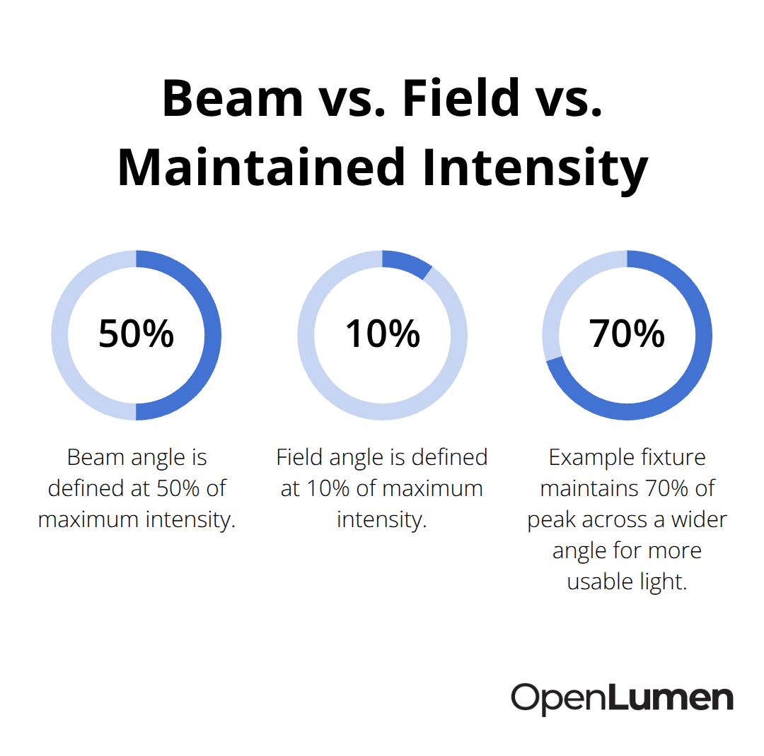
Candela measures luminous intensity in a specific direction, and it appears on every polar chart as the distance from the center to the outline. A higher candela value means brighter light in that direction. The critical insight is that candela alone does not predict how much light lands on your work surface-that depends on distance, mounting height, and how the intensity spreads across your coverage area. If a fixture has 8,000 candelas at peak but the light drops sharply outside the beam angle, you will see a bright hotspot surrounded by darkness. If another fixture has only 5,000 candelas at peak but maintains 70 percent of that intensity across a wider angle, it delivers more usable light to your actual work plane. This is why comparing two fixtures requires reading the entire polar distribution, not just the peak number.
Understanding Beam Angle and Field Angle
The beam angle, defined at 50 percent of maximum candela, tells you where the light remains strong enough to matter. For a retail downlight mounted 10 feet high, a 30-degree beam angle creates a lit circle roughly 5 feet in diameter on the floor. A 50-degree beam angle at the same height produces a circle nearly 9 feet across. If your fixture spacing is 12 feet, the 50-degree fixture overlaps better and eliminates dark gaps between lit areas.
The field angle, defined at 10 percent of maximum candela, shows the absolute outer boundary where light still contributes to illumination. Designers often focus only on beam angle and miss the field angle, but the field angle matters when you calculate uniformity or predict light spill beyond your intended coverage zone. For outdoor projects, field angle determines whether light escapes to neighboring properties or the sky. For indoor layouts, field angle reveals whether light bounces off walls and contributes to ambient brightness. A photometric report from the manufacturer includes both values, and you should always verify them directly on the polar chart rather than trusting a specification sheet summary.
Comparing Peak Candela Values Across Fixtures
Start with the candela scale on both polar charts-if one is scaled 0 to 10,000 and the other 0 to 50,000, the visual shapes will mislead you entirely. Next, locate and compare the peak candela values and note which direction (up, down, or sideways) the peak points. Then measure the beam angle on each chart and calculate the lit area diameter for your actual mounting height using basic trigonometry or a photometric layout tool. For a downlight at 10 feet high with a 40-degree beam angle, the diameter is roughly 2 × 10 × tan(20°), which equals about 7.3 feet.
Checking Symmetry and Distribution Patterns
Third, check whether the distribution is symmetric or asymmetric by examining if the polar shape looks identical at different C-plane angles-if the photometric report only shows one C-plane view, it is symmetric. An asymmetric fixture shows different shapes at C0, C90, and C180, which reveals how light actually spreads in three dimensions. Ignoring the full C-plane data and relying only on one view will lead to poor layout predictions and installation problems.
Evaluating Efficacy and Real-World Performance
Finally, note the total lumens and calculate efficacy by dividing lumens by input watts. Current commercial LED fixtures typically deliver 100 to 200 lumens per watt, with DLC Premium fixtures exceeding 135 lumens per watt depending on the category.
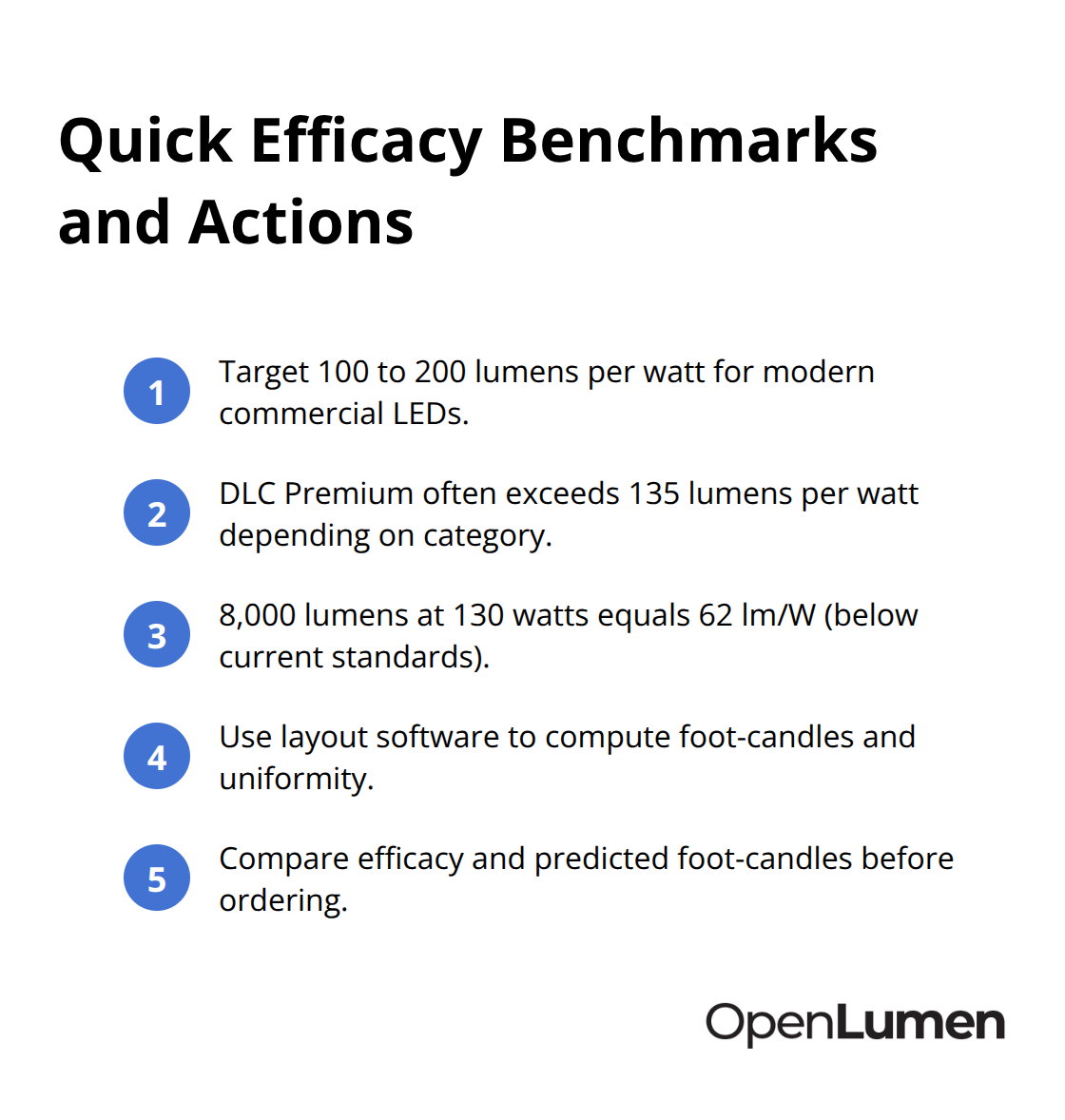
A fixture with 8,000 lumens and 130 watts achieves 62 lumens per watt, which is below current standards and signals either an older design or a specification error. When you overlay two fixtures in a photometric layout at your actual mounting height and spacing, the software calculates foot-candles on your work plane and uniformity ratios automatically. This approach transforms polar chart reading from an abstract exercise into a concrete comparison that predicts real-world performance before you place an order.
Final Thoughts
Polar chart interpretation basics transform how you select luminaires and predict real-world performance on your projects. Peak candela, beam angle, and distribution symmetry matter most when you compare fixtures side by side. A polar chart shows you exactly where light goes, how far it throws, and whether coverage will be even or spotty before you install anything.
Applying polar charts to your next project starts with requesting photometric reports from manufacturers and checking the candela scale first. Calculate your mounting height and fixture spacing, then measure beam angles directly on the polar plot rather than trusting summary numbers. If the distribution is asymmetric, examine all C-plane views to understand how light spreads in three dimensions, and run a quick foot-candle calculation using basic trigonometry or a photometric layout tool to verify that your chosen fixture delivers adequate illuminance and uniformity on your work plane.
Start with simple comparisons between two or three fixtures for a single project, then expand to full layouts as your confidence grows. OpenLumen lets you access community-verified luminaires with instant polar chart metrics and run real-time illuminance analysis without expensive software. The platform generates professional photometric layouts and reports that validate your selections before ordering, so your team designs faster and with confidence.
The information provided is for general educational purposes only and should not be considered professional engineering or lighting design advice. Always verify project requirements, local codes, and specifications with qualified professionals before making final decisions.