Polar chart analysis is how lighting professionals make fast, confident decisions about fixture performance. Instead of guessing whether a luminaire will work for your space, you get real data on light distribution, intensity zones, and coverage patterns.
At OpenLumen, we’ve seen how contractors and designers who master polar charts cut their design time in half. This guide shows you exactly how to read them and apply what you find to your next project.
What Polar Charts Actually Show
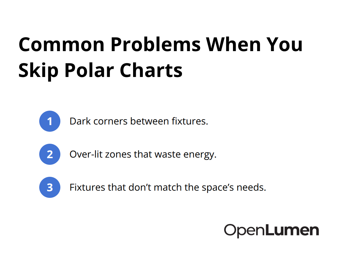
A polar chart in lighting maps light intensity across every direction a fixture emits. The radius represents candela (raw light intensity), and the angle represents direction-typically measured in degrees from 0° to 360° around the fixture. This circular format reveals exactly where a luminaire concentrates its light and where it falls off, something a spec sheet alone cannot show. Contractors and designers who skip this step often end up with dark corners, over-lit zones, or fixtures that don’t match the space. The photometric file contains this data; most professionals simply ignore it and make assumptions instead.
Why Light Distribution Patterns Matter More Than Wattage
A 100-watt fixture with poor beam control delivers less usable light than a 60-watt fixture with tight, focused distribution. Polar charts expose this reality immediately. They show whether a luminaire spreads light evenly across a room or concentrates it in a narrow hotspot. A recessed downlight with a 40° beam angle and 8,000 candela peak intensity produces a very different pattern than a wide-flood unit at 25,000 candela but 120° spread. The polar chart tells you the actual coverage footprint at different mounting heights and distances-critical information for spacing calculations. Without this data, you either over-space fixtures and create dark bands between them, or under-space them and waste energy on overlap.
Reading Candela Values and Intensity Zones
The concentric circles on a polar chart represent candela values, increasing from the center outward. A fixture with a narrow, tall peak in the polar plot concentrates light efficiently in one direction; a flatter, wider profile distributes light more uniformly. The steepness and width of the curve directly affect how many fixtures you need and where you can place them. A 4,000 candela peak at 0° (straight down) with a sharp drop-off beyond 45° requires closer spacing than a fixture with 3,000 candela but sustained output to 60°. The polar chart also shows asymmetry-many fixtures are not perfectly round. Some emit more light forward than backward, or stronger to one side. This asymmetry matters when fixtures are arranged in rows or grids; ignoring it creates uneven illumination.
Spotting Real Performance Differences
Two luminaires with identical wattage can perform completely differently on a polar chart. The shape of the curve tells you whether a fixture suits tight accent lighting, broad area coverage, or something in between. A sharp, concentrated peak works well for highlighting artwork or architectural features. A broad, gentle curve suits general ambient lighting across open spaces. Asymmetrical patterns (stronger output in one direction) help you optimize fixture placement in corridors, retail displays, or directional applications. The polar chart removes guesswork from these decisions and lets you match the fixture to the actual space requirements before installation begins.
Using Polar Data to Compare Luminaires
When you evaluate multiple fixtures for the same application, polar charts let you compare their actual performance side by side. Place the charts next to each other and look at peak candela, beam width, and uniformity. A fixture with 6,000 candela and a 50° beam spread covers a different area than one with 5,000 candela and 70° spread-the polar chart makes this difference visible instantly. You can also spot which fixture maintains better light output at wider angles, which matters for spacing and coverage consistency. This comparison process takes minutes with polar data and hours without it, which is why contractors and designers who master this skill move faster through the selection phase.
The next step is learning exactly how to extract these insights from the polar chart and apply them to your specific project conditions.
How to Read Candela and Spot Real Performance Problems
Understanding Candela Values on the Polar Chart
The concentric circles on a polar chart represent candela values, and their spacing tells you how light intensity changes across angles. Start at the center and move outward-each ring marks an increase in candela. A fixture with a sharp, tall peak concentrated near 0° (directly below the fixture) means light focuses tightly downward; that peak height is your maximum candela value. If the curve flattens quickly beyond 45°, the fixture drops off light intensity fast at wider angles. This matters because it controls spacing. A fixture with 8,000 candela at 0° but only 2,000 candela at 60° needs closer spacing than one with 6,000 candela sustained to 75°. The second curve covers more floor area at typical mounting heights.
Many contractors fixate on peak candela alone and ignore the angle at which that peak occurs. A 10,000 candela fixture that peaks at 45° off-axis performs completely differently than 10,000 candela straight down. The polar chart exposes this difference immediately.
Recognizing Asymmetry and Directional Patterns
Asymmetry appears immediately on the polar chart-some fixtures emit stronger light to one side or forward versus backward. Recessed downlights in retail often show asymmetrical patterns because the lamp socket blocks some light. Wallwash fixtures are deliberately asymmetrical to concentrate light toward the wall. When you ignore asymmetry and space fixtures in a grid assuming symmetry, you create uneven illumination.
Look at the overall shape: narrow and steep means concentrated accent lighting, broad and gentle means ambient coverage, and irregular curves mean directional applications. The shape tells you exactly what job the fixture handles best.
Comparing Fixtures Side by Side
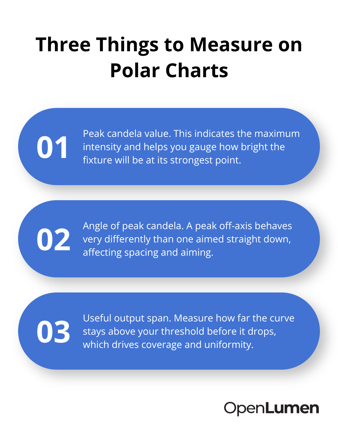
Comparing multiple fixtures requires placing their polar charts side by side and measuring three specific things: peak candela value, the angle at which that peak occurs, and how far the curve extends before dropping below useful thresholds. A fixture with 5,000 candela at 0° and a curve that stays above 3,000 candela to 70° covers roughly twice the diameter at a 10-foot mounting height compared to one with 8,000 candela but a sharp drop-off at 40°.
Calculate the actual coverage footprint using the fixture’s candela values and your specific mounting height-this removes guesswork from spacing decisions. If fixture A has a 50° beam spread and fixture B has a 75° spread, fixture B needs wider spacing but fewer total fixtures to cover the same area. The polar chart makes this trade-off visible instantly instead of requiring manual calculations or trial-and-error mock-ups.
Spotting Hidden Performance Gaps
Two fixtures with identical wattage and lumen output can have completely different polar profiles. One might concentrate light efficiently in a narrow zone while the other spreads light thinly across a wide area. The narrow one suits accent or display lighting; the wide one suits general area coverage. This comparison process determines whether you need 12 fixtures or 16 fixtures for your space, which directly affects project cost and energy consumption.
Contractors who skip polar analysis often over-specify fixtures out of caution, driving up costs unnecessarily. Those who read the charts accurately right-size their designs and win bids. The next step is learning how to apply these insights to actual project conditions and validate your fixture selections before installation begins.
Putting Polar Data Into Your Design Right Now
Polar charts only deliver value when you translate the data into actual fixture selections and spacing decisions. Start by defining your space requirements precisely: the area you need to light, the mounting height of your fixtures, and the illuminance target for that space. A retail display needs 500–750 lux on merchandise; general office areas typically need 300–500 lux; warehouse aisles need 150–300 lux. Once you know your target, pull the polar charts for three to five candidate fixtures and compare their peak candela, beam spread, and asymmetry patterns directly against your space dimensions. A 20-foot-wide retail counter at a 12-foot mounting height requires different fixture spacing than a 40-foot warehouse aisle at 20 feet. The polar chart tells you instantly whether a narrow-beam accent fixture covers that counter adequately or whether you need a wider-spread general-purpose unit.
Calculate the actual coverage diameter at your mounting height using the fixture’s candela distribution-this is where most designers make their mistake by relying on manufacturer beam angle specifications alone, which ignore the actual light falloff beyond the beam edge. A fixture rated 40° beam angle still emits measurable light to 60° or 70° on the polar chart; knowing where that light actually falls determines whether you space fixtures 8 feet or 12 feet apart.
Spacing Calculations From Polar Data
The ratio between peak candela and candela at wider angles determines your maximum fixture spacing without creating dark spots. A fixture with 8,000 candela at 0° that drops to 4,000 candela at 60° can be spaced wider than one with 8,000 candela at 0° but only 1,500 candela at 60°. Most contractors use rule-of-thumb spacing ratios of 1.0 to 1.5 times the mounting height-a fixture at 10 feet mounts roughly 10 to 15 feet apart from its neighbors. This works only if you verify it against the actual polar chart for your selected fixture.
A fixture with gentle falloff sustains that wider spacing; one with steep falloff needs tighter spacing to prevent dark zones between fixtures. Asymmetrical fixtures in rows require even more attention because the direction of the asymmetry determines coverage uniformity. A wallwash fixture pointed toward the wall creates a very different illuminance pattern than the same fixture pointed away from it. The polar chart shows this asymmetry clearly; ignoring it costs you either insufficient wall illumination or wasted light on the opposite side of the space.
Validating Fixture Performance Before Installation
Once you select fixtures and calculate spacing, use the polar chart to predict actual illuminance across your space before installation begins. Many lighting software platforms now accept photometric files and run illuminance simulations-this prevents costly mistakes where you install 16 fixtures only to discover dark corners or over-lit zones. Run the simulation at your actual mounting height, fixture spacing, and room reflectance values. If the simulation shows illuminance below your target in certain areas, adjust spacing tighter, select a fixture with wider beam spread, or add supplemental fixtures.
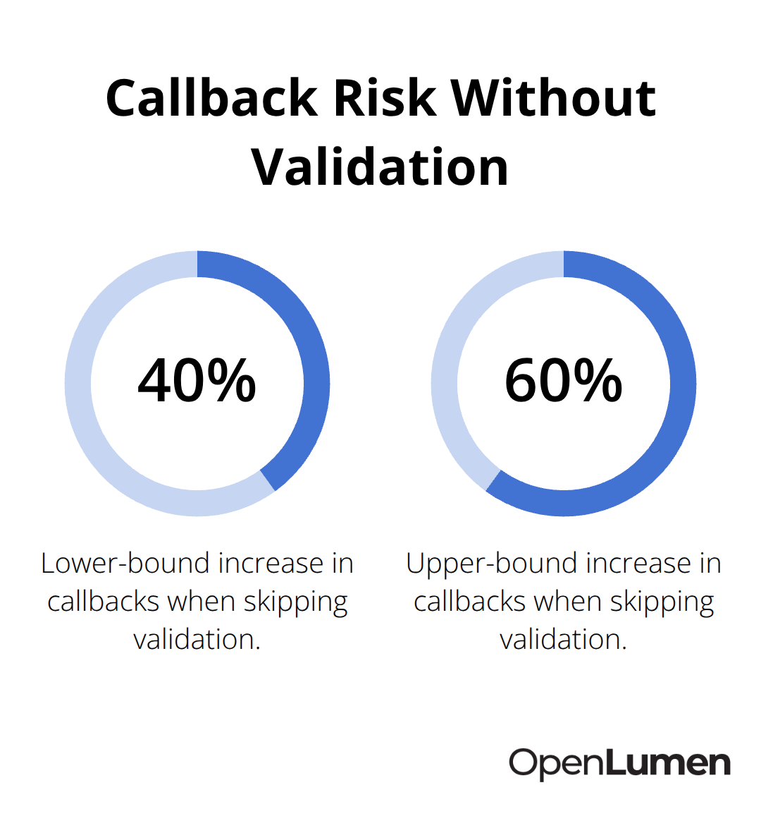
The polar chart comparison process takes 30 minutes for most projects and saves thousands in rework or fixture replacement after installation. Contractors who validate designs this way rarely encounter callbacks for inadequate lighting or customer dissatisfaction. Those who skip validation and rely on guesswork experience callbacks 40 to 60 percent more often, according to industry lighting audits.
The upfront time investment in polar chart analysis and simulation pays off immediately in faster bids, more accurate installations, and fewer change orders.
Final Thoughts
Polar chart analysis transforms lighting design from guesswork into a data-driven process that saves time and prevents costly mistakes. When you read candela values, spot asymmetry, and compare fixtures side by side using their actual polar data, you eliminate the trial-and-error phase that slows most projects down. Contractors and designers who master this skill move through fixture selection and spacing calculations in hours instead of days, which directly improves bid turnaround and project profitability.
Start with your next project by defining your space requirements precisely-mounting height, area dimensions, and illuminance targets. Pull polar charts for your candidate fixtures, compare their peak candela and beam spread, and calculate spacing based on actual light falloff rather than manufacturer beam angle specs alone. Run an illuminance simulation before installation to catch dark spots or over-lit zones while you can still adjust (this validation step takes 30 minutes and prevents callbacks that cost far more).
Access photometric data and run real-time illuminance analysis with OpenLumen‘s free platform, which streamlines your entire design-to-install workflow without expensive software or steep learning curves. Pull three candidate fixtures, place their polar charts side by side, and spend 15 minutes comparing them against your actual space requirements. That confidence translates directly into faster installations, fewer callbacks, and stronger client relationships.
The information provided is for general educational purposes only and should not be considered professional engineering or lighting design advice. Always verify project requirements, local codes, and specifications with qualified professionals before making final decisions.