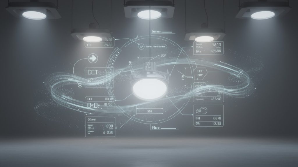
Polar charts show exactly how light spreads from a luminaire in every direction. Most lighting professionals skip this step, which leads to dark spots, wasted energy, and disappointed clients.
At OpenLumen, we’ve seen how luminaire polar chart analysis transforms project outcomes. This guide teaches you to read these charts fast and pick the right fixtures every time.
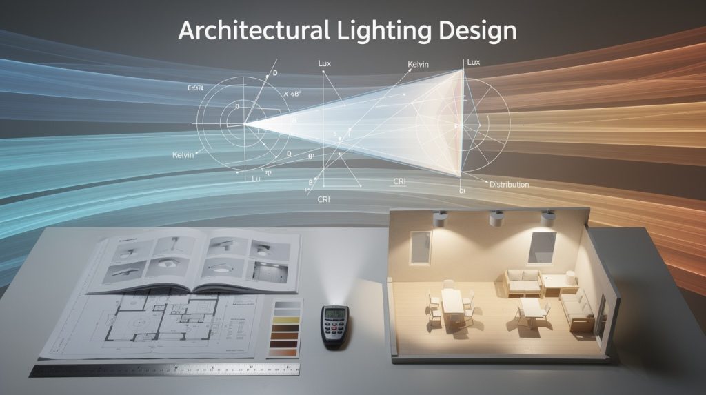
Luminaire Polar Charts: What They Show and Why They Matter
What Polar Charts Actually Show
A polar chart maps luminous intensity in candelas at every angle around a luminaire. Instead of guessing how light spreads, you see exact data: how many candelas point downward (gamma=0°), sideways (gamma=90°), and upward (gamma=180°). The C-plane defines the direction-C=0° faces right, C=90° faces forward, C=180° faces left, and C=270° faces back. This coordinate system lets you rotate the luminaire mentally and predict exactly where light lands in your space.
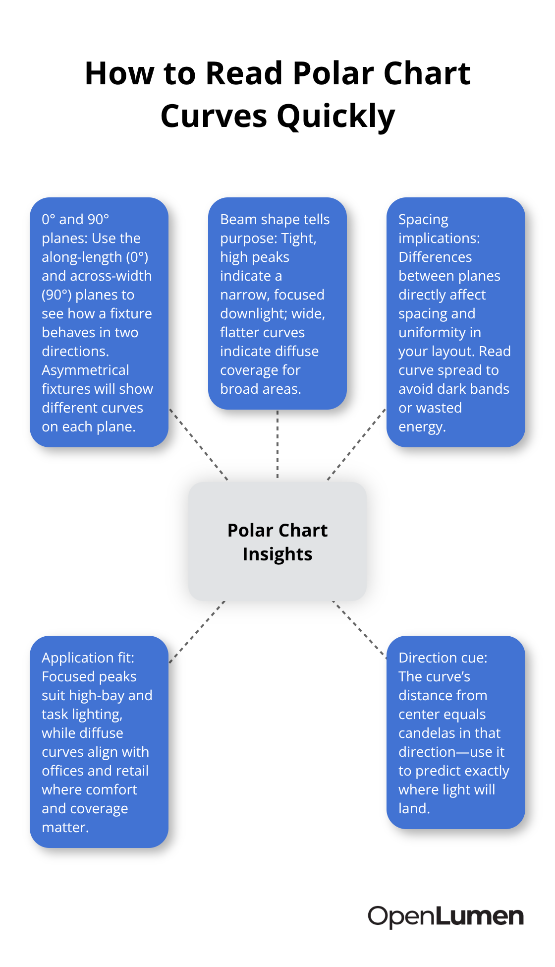
Most photometric reports include at least two planes: the 0° plane along the fixture’s length and the 90° plane across its width. Asymmetrical fixtures show different intensity patterns on each plane, which directly affects spacing and uniformity. The distance from the chart’s center to any point on the curve represents candela output in that direction; a tight, concentrated peak indicates focused downlight (typical of high-bay fixtures), while a wider, flatter curve indicates diffuse coverage (common in office and retail).
Zonal lumen summaries break total output into angular zones-0–30°, 0–60°, 0–90°, 90–180°-so you know exactly how much light goes down versus up. For indoor fixtures, try for 90% or more of lumens in the 0–90° range with minimal uplight; outdoor fixtures must meet BUG ratings (Backlight, Uplight, Glare) that many municipalities enforce for dark-sky compliance.
Why Polar Data Beats Lumen Ratings Alone
Two luminaires with identical lumen output and wattage can have completely different optical performance. A 7,990-lumen fixture at 56.61 watts delivers 141.15 lumens per watt, but that efficacy number tells you nothing about where the light actually goes. One fixture might concentrate intensity in a tight 30° beam, while another spreads the same lumens across a 120° pattern.
Comparing fixtures using only lumens and wattage causes you to miss critical distribution details that determine project success. Polar charts reveal whether a fixture uses direct (all light downward), indirect (mostly upward), or direct-indirect (mixed) distribution. Batwing distributions, for example, send light upward to bounce off ceilings and sideways to avoid harsh shadows-perfect for offices but wrong for warehouses. The polar diagram shows this instantly; the numerical data (normalized to 1,000 lumens or absolute candelas) feeds into design software like DIALux or AGi32 for precise spacing and uniformity calculations.
Spacing criteria printed on catalog sheets multiply by mounting height to yield the inter-luminaire distance needed to maintain uniform illumination; without understanding the polar distribution shape, you’ll either over-space fixtures (creating dark bands) or under-space them (wasting energy). Glare risk appears in the polar data too-light in the 60–90° zone from horizontal increases discomfort glare, so comparing this zone across candidates helps you avoid fixtures that blind occupants.
Reading Absolute vs. Normalized Intensity Values
Photometric reports provide two intensity datasets: absolute candelas (for a specific lamp type and wattage) and normalized values in candelas per kilolumen (cd/klm). Absolute data matters when you have an exact fixture configuration-say, a 3,300-lumen LED at rated power. To convert normalized to absolute, multiply cd/klm by lumens and divide by 1,000; for example, 530 cd/klm × 3,300 lm ÷ 1,000 = 1,750 candelas.
Normalized data lets you compare luminaires with different outputs on a single chart at a glance. The polar diagram scales curves to 1,000 lumens, so a 5,000-lumen fixture and a 10,000-lumen fixture show identical normalized curves if their distributions match. This approach is powerful: you can overlay polar charts from multiple candidates and immediately see whose beam shape fits your space best.
Measurements taken every 5° or more across multiple C-planes (at least 15° intervals) provide the resolution needed for accurate spacing predictions. When evaluating fixtures, always verify that the photometric lab is NVLAP-accredited and that the report declares lamp type, rated power, and test date; self-testing without independent oversight signals potential data manipulation.
Moving From Theory to Real-World Application
Now that you understand what polar charts show and how to read the intensity values, the next step is learning how to interpret the actual distribution patterns and use them to select the right luminaire for your specific project conditions.
How to Read Polar Charts Like a Professional
The candela distribution curve reveals the true power of polar charts. Instead of staring at a single number like 7,990 lumens, you see the actual intensity at every angle-typically measured every 5° across multiple C-planes. The vertical axis shows gamma angles (0° points straight down toward the floor, 90° is horizontal, 180° points upward toward the ceiling), and the horizontal axis shows C-planes (C=0° faces right, C=90° forward). The distance from the chart center to any point on the curve equals candelas in that direction. A tight, concentrated peak tells you the fixture throws light in a narrow beam; a wide, flat curve indicates diffuse spread across a broader area. Most reports include curves for at least two planes-the 0° plane along the fixture length and the 90° plane across its width. Asymmetrical fixtures show visibly different curves on each plane, which directly impacts how you space them in your layout.
Spot the Distribution Type Instantly
Direct, indirect, and direct-indirect distributions look unmistakably different on a polar chart. Direct fixtures send nearly all intensity downward (gamma=0–90°), with minimal or zero candelas pointing upward; you’ll see the curve concentrated in the lower half. Indirect fixtures reverse this-the bulk of intensity lives in the gamma=90–180° range, bouncing light off ceilings and upper walls. Direct-indirect (or mixed) fixtures show meaningful peaks in both zones, typically 60–70% downward and 30–40% upward.
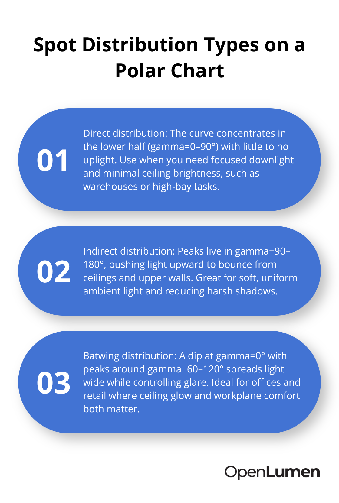
Batwing distributions are instantly recognizable: they show a dip or valley at gamma=0° and peaks around gamma=60–120°, creating wide uplight on the ceiling and focused workplane illumination below. This shape works brilliantly for offices and retail where you want to avoid harsh shadows and glare, but it’s wrong for warehouses where you need concentrated downlight. The polar diagram makes this decision obvious; a numerical lumen rating never would.
Identify Glare Risk From the Polar Data
Fixtures with high candelas in the 60–90° zone from horizontal produce discomfort glare that occupants notice immediately. Compare this specific zone across your candidate luminaires, and you’ll avoid the mistake of picking a fixture that blinds people. The polar chart shows exactly where this risk lives, so you can eliminate problem fixtures before they reach your project.
Convert Polar Data Into Spacing and Uniformity
Normalized intensity values (candelas per kilolumen, or cd/klm) let you compare fixtures with different outputs on the same chart. The curves scale to 1,000 lumens, so a 3,300-lumen fixture and a 10,000-lumen fixture show identical normalized distributions if their optical designs match. The manufacturer’s spacing criteria-printed on catalog sheets-multiply by your actual mounting height to yield the inter-luminaire distance needed for uniform illumination. If the catalog shows spacing at 10 feet and your ceiling is 12 feet, multiply the listed spacing by 1.2. This calculation prevents the two mistakes we see constantly: over-spacing (which creates dark bands between fixtures) and under-spacing (which wastes energy and overheats equipment).
Use Zonal Data to Verify Balance
Zonal lumen summaries in the photometric report break total output into angular zones: 0–30°, 0–60°, 0–90°, 90–180°. For indoor fixtures, try for 90% or more in the 0–90° range with minimal uplight; a fixture showing 42% in 0–30°, 78% in 0–60°, 96% in 0–90°, and only 4% in 90–180° is well-balanced for most interiors. Outdoor fixtures face BUG ratings (Backlight, Uplight, Glare) that many municipalities enforce; the zonal breakdown helps you meet local dark-sky requirements.
Transform Polar Charts Into Illuminance Grids
When you import the fixture’s IES file into design software like DIALux or AGi32, the polar data automatically calculates illuminance grids showing foot-candles across your space for a given mounting height. These grids reveal uniformity ratios-try around 3:1 for most offices, 4:1 for parking, and 6:1 for roadways. Without the polar chart, you’re guessing; with it, you’re designing with precision. The next step is learning how to apply this knowledge to real project scenarios and select luminaires that deliver both performance and client satisfaction.
Matching Polar Data to Your Specific Space Requirements
Start With Your Illuminance Target
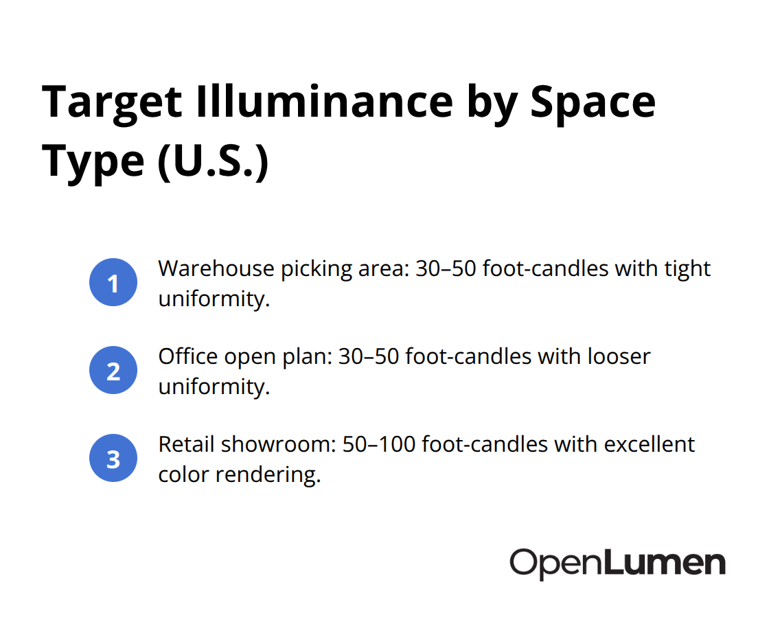
Start with your space’s illuminance target, then work backward to the polar chart. A warehouse picking area needs 30–50 foot-candles with tight uniformity; an office open plan needs 30–50 foot-candles but tolerates looser uniformity; a retail showroom demands 50–100 foot-candles with excellent color rendering. Once you know your target, pull the photometric reports for three to five candidate fixtures and compare their zonal lumen breakdowns side by side.
A fixture sending 96% of light into the 0–90° range with only 4% uplight works for warehouses and task-critical spaces. A batwing distribution with 70% downlight and 30% uplight suits offices where ceiling bounce matters and glare control is essential. The polar chart makes this comparison instant; lumen ratings alone force you to guess.
Calculate Spacing and Verify Uniformity
Next, calculate your required fixture count using the manufacturer’s spacing criteria multiplied by your actual mounting height. If a catalog lists 12-foot spacing at 10-foot mounting height, your 14-foot ceiling requires 1.4× the listed spacing. This single calculation prevents the costly error of under-spacing (energy waste, overheating) or over-spacing (dark bands, customer complaints).
Import the IES file into DIALux or AGi32 to verify uniformity ratios before ordering; a 3:1 average-to-minimum ratio works for most interiors, while parking lots typically target 4:1. The polar data feeds directly into these tools, eliminating manual spreadsheet work and reducing design errors.
Compare Fixtures With Discipline
Never compare fixtures based on lumens alone-two 10,000-lumen fixtures can deliver radically different performance. Instead, overlay their normalized polar curves on the same chart and identify which beam shape matches your space geometry. Check the glare zone (60–90° from horizontal) on each candidate; fixtures with high candelas here will blind occupants, regardless of total lumens.
Verify that each photometric report comes from an NVLAP-accredited lab with a declared test date and lamp configuration; reports lacking these details signal potential data manipulation. For outdoor projects, check the zonal breakdown against local dark-sky ordinances-many municipalities cap uplight at 5% or less.
Finalize Your Selection With Software Analysis
Indoor projects require verification that CRI (expect ≥90 for retail or healthcare, ≥80 for general commercial) and CCT match your project specs before final selection. Once you’ve narrowed candidates to two or three, request their IES files and run a full layout analysis in design software. This step takes 20 minutes but catches spacing mistakes, uniformity failures, and glare issues before installation. The polar chart transforms fixture selection from a guessing game into a data-driven process that protects your reputation and your client’s budget.
Final Thoughts
Luminaire polar chart analysis transforms fixture selection from guesswork into precision engineering. Two luminaires with identical lumen output deliver radically different performance based on their candela distribution, beam shape, and intensity patterns across C-planes and gamma angles. The polar diagram reveals this instantly, while a lumen rating never would. Spacing calculations, uniformity ratios, glare risk assessment, and zonal lumen breakdowns all flow directly from the data embedded in these charts.
Digital tools have made polar chart analysis accessible to everyone. Design software like DIALux and AGi32 import IES files and automatically calculate illuminance grids, spacing requirements, and uniformity ratios based on your actual room geometry and mounting height. For teams without access to expensive design software, OpenLumen offers a free, browser-based platform that lets you create photometric layouts, run real-time illuminance analysis, and access instant polar charts and zonal lumen data for thousands of community-verified luminaires. You can validate fixture performance, generate professional reports, and compare candidates in minutes rather than hours.
Pull three to five candidate fixtures for your next project, request their photometric reports and IES files, and spend 20 minutes comparing their polar charts and zonal breakdowns against your illuminance target and space geometry. Verify that each report comes from an NVLAP-accredited lab with a declared test date and lamp configuration. This disciplined approach protects your reputation, keeps projects on budget, and delivers the even, glare-free illumination your clients expect.
The information provided is for general educational purposes only and should not be considered professional engineering or lighting design advice. Always verify project requirements, local codes, and specifications with qualified professionals before making final decisions.